What Is KPI Analysis? How to Design Dashboards and Run Reviews
Shusaku Yosa
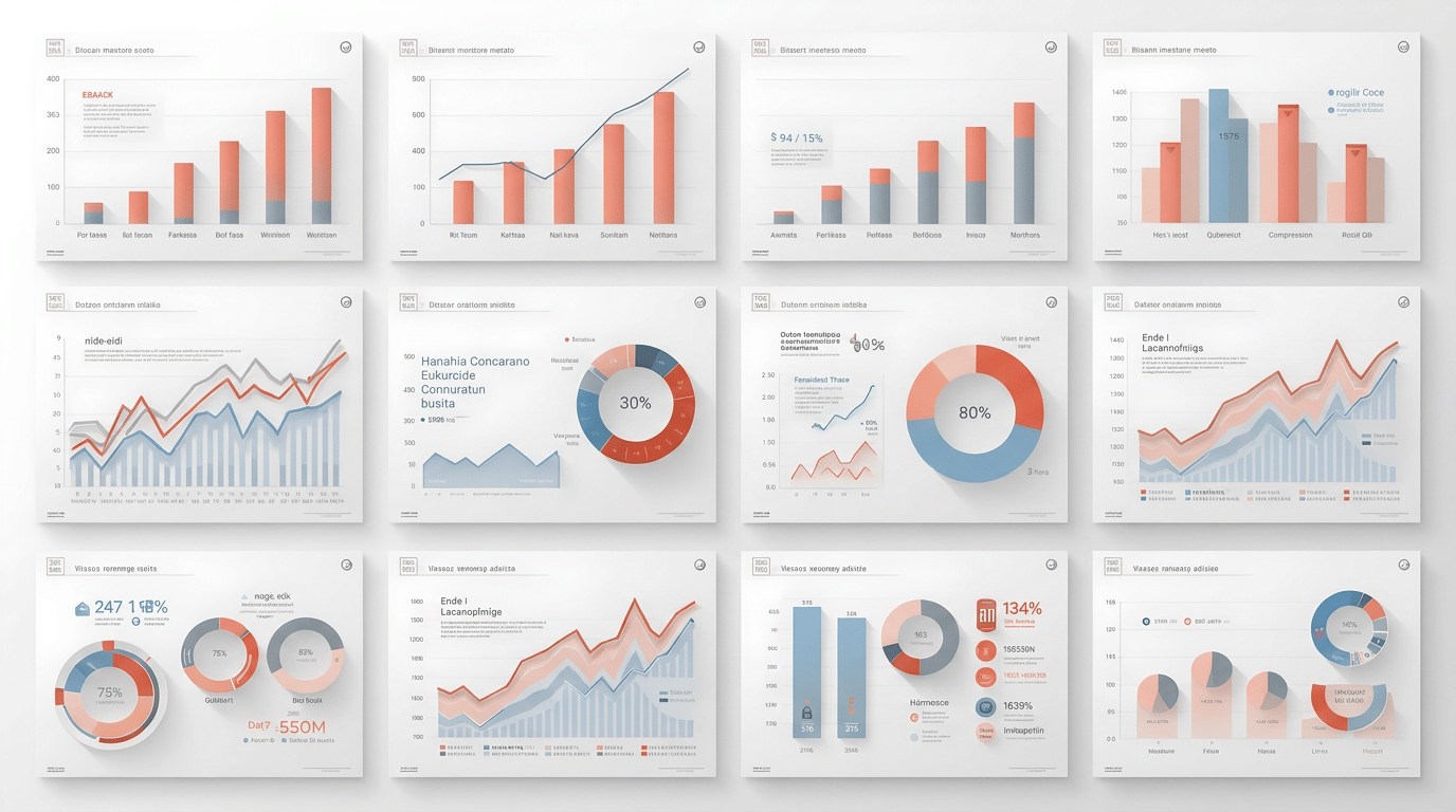
"We built the dashboard, but no one actually looks at it." "The numbers are all lined up, but I don't know what to do next." These are common complaints in KPI analysis. KPI analysis isn't about lining up metrics; it's an effort to connect numbers to decisions and action. This article organizes the basics of KPI analysis, its relationship with KGI, how to design a dashboard, and how to run reviews that don't become a mere formality—all from a practical standpoint.
What is KPI analysis?
A KPI (Key Performance Indicator) is an intermediate metric that measures whether an organization or initiative is moving in the right direction toward the ultimate goal, the KGI. KPI analysis refers to the whole process of monitoring the trends and attainment of these metrics, reading the causes of change, and deriving the next action.
What's important is that KPI analysis is not "recording and reporting" but a "trigger for action." If it isn't decided who does what after seeing the numbers, no amount of meticulous analysis will lead to results.
The relationship between KPI and KGI—view metrics as a hierarchy
KPIs don't exist in isolation; they have a hierarchical structure. The basic approach is to break down from the management-level KGI (Key Goal Indicator) at the top into department KPIs, team KPIs, and individual action metrics. When this hierarchy is designed correctly, it becomes clear how each individual action on the ground connects to the management goal.
For example, when there is a KGI of "annual revenue of 1 billion," you break it down into KPIs such as "monthly leads acquired," "opportunity conversion rate," and "average deal size," and further into per-salesperson action metrics (calls, visits, proposals). This breakdown diagram is what's known as a KPI tree. When organizing metrics, it helps to be conscious of layers: result metrics (KGI), the driver KPIs that influence them, and health KPIs that show the state of things.
Steps to design a dashboard that supports KPI analysis
To run KPI analysis continuously, you need a dashboard that visualizes the metrics. Proceeding with the following steps reduces rework in the design.
- Define the purpose and the users: decide first "who looks at it, when, and for what decision." The metrics, granularity, and update frequency differ entirely between a monthly executive review and a frontline staffer's daily monitoring.
- Choose the metrics to display from the KPI tree: don't cram every metric onto one screen; narrow to the most important. A guide is 3–5 numbers everyone looks at, 7 at most.
- Structure information in layers: place an overview layer at the top (KPI summary number cards), an analysis layer in the middle (trend and composition charts), and a detail layer at the bottom (tables that allow drill-down), so it reads in the order "how are we now → why → what should we do."
- Validate with a wireframe: before implementing in a BI tool, create a layout draft on paper or slides and have users review it. Confirming before implementation that people can reach the information they need prevents rework.
- Tie numbers to actions: for each metric, decide in advance "if this number does this, we do that." Only then is there a reason to look at the dashboard.
Choose the chart type by working backward from "what do I want to judge with this number." A line chart suits tracking trends, a bar chart suits comparing items, and a number card suits grasping the current position. Showing month-over-month, year-over-year, and target comparisons alongside makes changes and anomalies easier to notice.
Make metrics "actionable" with thresholds and alerts
Once you've designed the KPIs, set up a definition sheet (a list of each KPI's meaning, formula, and data source) and thresholds. For example, defining states like red, yellow, and green lets you tell at a glance which metric is a danger signal the moment you look at the dashboard.
Furthermore, setting automatic alerts (BI tool notifications, Slack integration, etc.) for metrics that fall below a threshold creates a mechanism where "when the numbers move, the organization moves." Maintaining the definition sheet is also important for ensuring consistent figures across every dashboard.
How to run reviews—design the rhythm
The biggest reason dashboard adoption fails is focusing too much on "building" and neglecting the design of "operation." To embed KPI analysis in the organization, it's essential to decide the review rhythm in advance.
- Daily: staff monitor frontline operational metrics and respond on the spot if there's an anomaly.
- Weekly: focus on driver KPIs and check the progress of initiatives and bottlenecks. In meetings, use the numbers as a starting point to discuss "why did this happen" and "what to do next."
- Monthly: review the KGI and most important metrics on the executive dashboard and take an overview of progress against goals.
- Quarterly: review the KPIs themselves and the dashboard's composition. Decide by consensus on KPIs to add, KPIs to consolidate, and KPIs to retire.
Particularly important is deciding on a single dashboard owner. Without someone responsible for changing KPI definitions and making revisions, it tends to become a "dashboard no one touches" over time. You also need a posture of revising the KPIs themselves as the business phase changes. It's not unusual for a company that has chased only revenue to shift its focus to LTV or NRR (Net Revenue Retention) as the phase changes.
Common failures in KPI analysis and countermeasures
- Too many metrics, so no one looks: narrow metrics by working backward from decisions, and define conditions for deletion candidates to slim them down regularly.
- Looking at numbers and ending with "huh": tie an action to each metric and make thresholds and alerts the trigger for action.
- The team's direction scatters: use a KPI tree to break metrics down consistently from the company-wide KGI and make them a common language.
- Data is too old to use: build update frequency and data freshness into the design so numbers are ready in time for decisions.
Summary
KPI analysis is the process of monitoring intermediate metrics that measure progress toward the KGI, reading the causes, and connecting them to action. Layering metrics with a KPI tree, designing the dashboard starting from purpose and users, and structuring it in the overview → analysis → detail hierarchy is the starting point. Then, by making metrics "actionable" with thresholds and alerts and systematizing a daily, weekly, monthly, and quarterly review rhythm, KPI analysis avoids becoming a formality and takes its place at the center of decision-making. Not lining up numbers, but making numbers a shared language to move the organization—that is the essence of KPI analysis.